
Representational Analytics: Making Data Less Boring (And Hopefully More Useful)
Let’s face it: raw data is about as thrilling as watching paint dry. Spreadsheets full of numbers? Yawn. But when you take all that data and make it visual—think charts, graphs, and heat maps—suddenly, it’s like seeing your life flash before your eyes, but with more pie charts. That’s the magic of representational analytics. It’s the art of taking boring information and turning it into something people can actually understand—and maybe even get excited about (if they’ve had enough coffee).
The Basics (Or, How to Not Fall Asleep While Analyzing Data)
Representation:
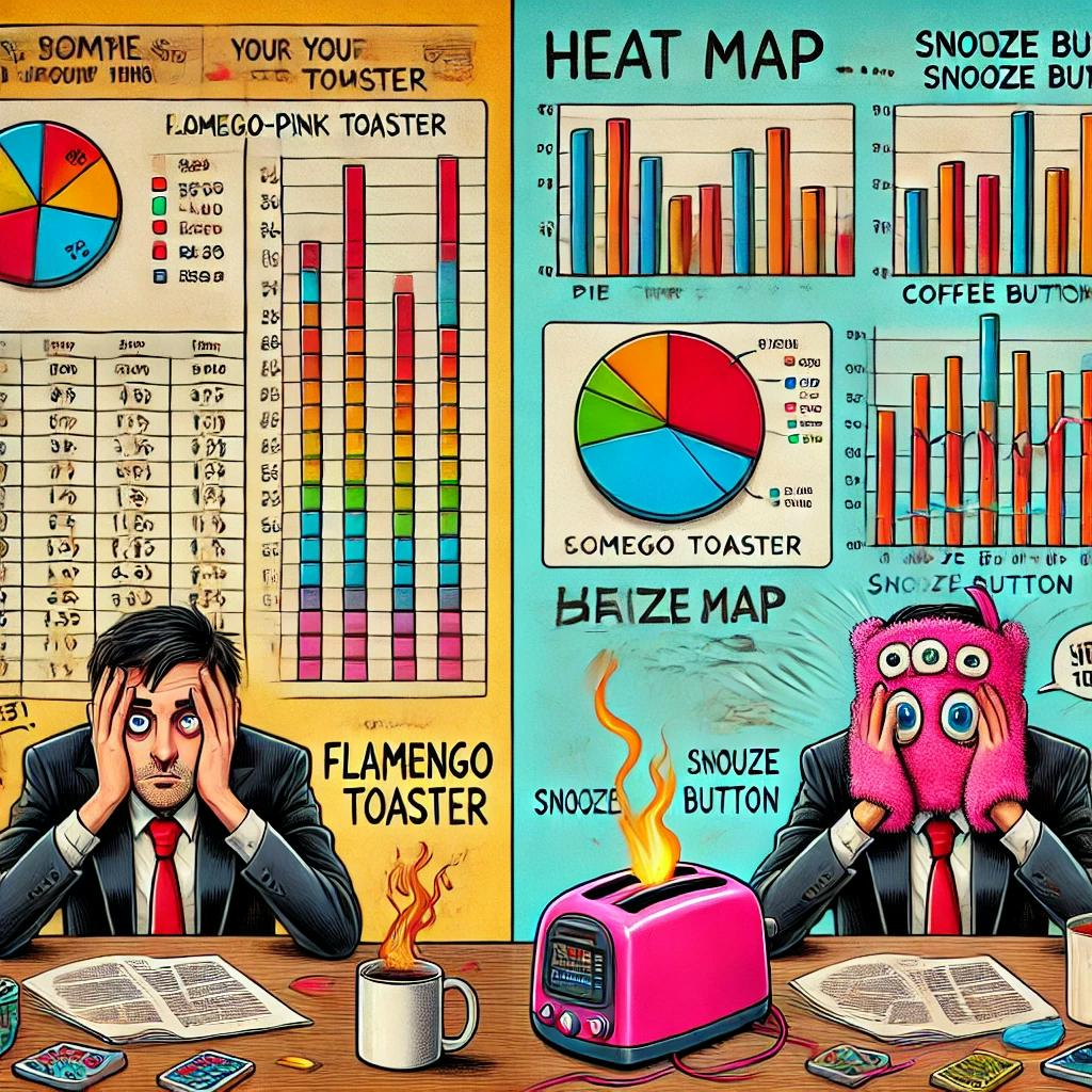
Imagine this: instead of staring at a spreadsheet of quarterly sales figures, you see a colorful pie chart showing that, yes, the “flamingo-pink toaster” you thought was a dumb idea is, in fact, your best seller. Who knew? It’s all about how data is displayed. Bar graphs, line graphs, pie charts, whatever—anything is better than endless rows of numbers that make your brain want to explode.
Data Visualization:
This is where the magic happens. Data visualization turns your information into something people can actually see and get. Here are some of the classics:
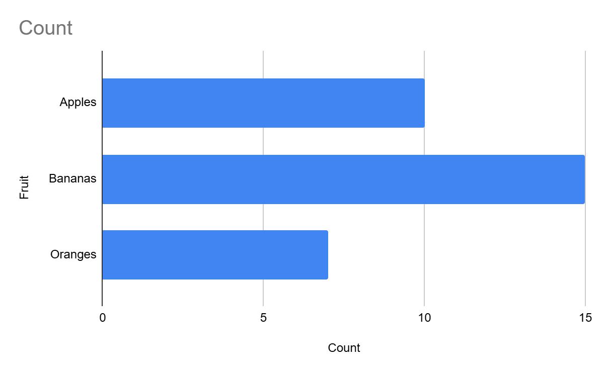
- Bar Graphs: A bar graph is a way to show information using rectangular bars. Each bar represents a different item or group, and the height or length of the bar shows how much of something there is. The taller or longer the bar, the more it represents. It’s used to compare things easily.
Why Use a Bar Chart Here?
- Comparison: Bar charts are ideal when you want to compare values across categories (in this case, fruit types).
- Clarity: The length of each bar clearly shows the relative size of the values, making it easy to visually compare the quantities.
- Simple: Bar charts are straightforward and effective when there are a small number of categories (like 3 types of fruits).
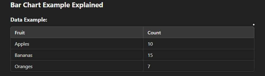
Example:
1. Bars:Each fruit category will have a bar, where the length (height) of the bar corresponds to the number of fruits. For example, the Bananas bar will be the tallest since it has the highest count (15).
2. Interpretation:By looking at the bar chart, it’s easy to see that Bananas have the most fruit, followed by Apples, and Oranges have the least.
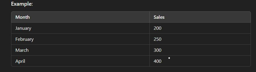
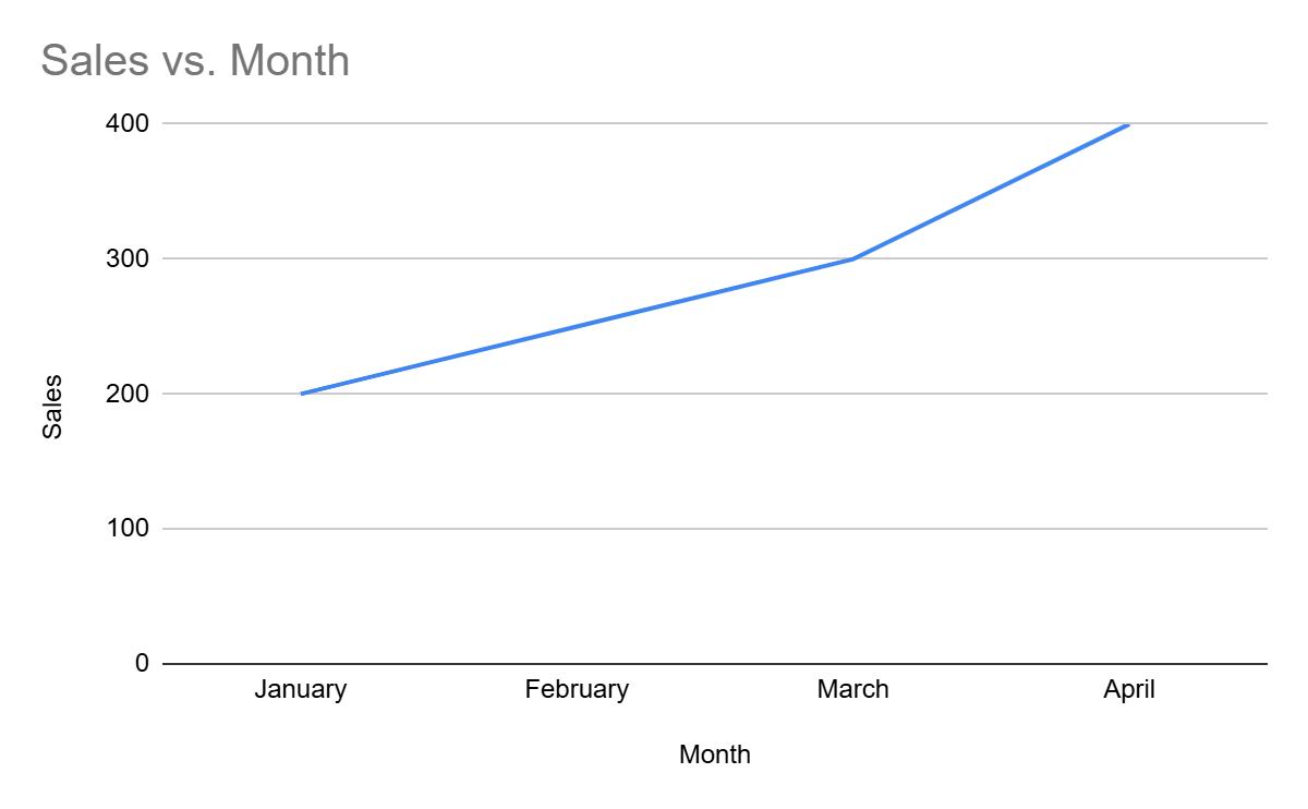
- Line Graphs: A line graph is ideal when showing the change of a variable over a period of time (e.g., sales trends across months). Points are plotted on the graph and connected with lines to show the movement between them.
When to Use :
- To track changes over time
- When you have continuous data.
- E.g., stock prices, website visits, or temperature changes.
Why Choose:
Excellent for showing trends, patterns, and comparing multiple data series.
Example:
- Pie Chart: A pie chart represents data as slices of a circle, where each slice corresponds to a proportion of the total. It’s great for visualizing how parts make up a whole (e.g., market share of different brands).
When to Use :
- When you need to show parts of a whole (percentages or proportions).
- E.g., budget allocation, sales distribution.
Why Choose:
Ideal for simple proportion comparisons, though not effective for showing precise comparisons.
Example:


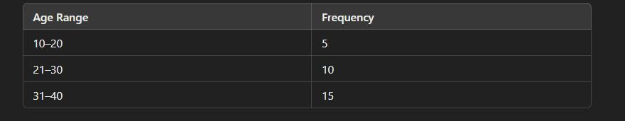
- Histogram: A histogram is used to show how data is distributed across different ranges (bins). Unlike bar charts, histograms deal with continuous data and help you see the frequency of data points within a given range.
When to Use :
- For continuous data that fits into defined ranges (e.g., age ranges, income brackets).
- To understand the distribution of data.
Why Choose:
It’s great for visualizing the distribution of a variable and detecting patterns, such as skewness or outliers.
Example:
- Scatter Plot: A scatter plot displays individual data points on a Cartesian plane to investigate relationships between two variables.It helps to identify correlations (positive, negative, or none)
When to Use :
- To explore the relationship between two continuous variables.
- E.g., height vs. weight, hours worked vs. productivity.
Why Choose:
Useful for identifying trends, clusters, or outliers in the data.
Example:


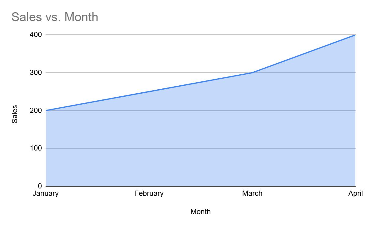
- Area Chart: Area charts are similar to line graphs, but they fill the area below the line, emphasizing the volume of change over time. It’s useful for showing cumulative data.
When to Use :
- To show how quantities accumulate over time.
- Ideal for visualizing total growth or decline (e.g., sales over the months).
Why Choose:
Great for visualizing the magnitude of change in data over time.
Example:

- Bubble Chart: A bubble chart is an extension of the scatter plot, where each point is represented by a bubble, and the bubble size can indicate a third variable (e.g., demand).
When to Use :
- When you need to show the relationship between three continuous variables.
- E.g., price vs. demand vs. market share.
Why Choose:
Provides an intuitive way to show three dimensions of data.
Example:


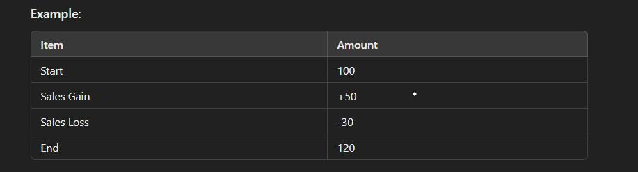
- Waterfall Chart: Waterfall charts are used to visualize incremental changes over time or stages. It’s particularly useful for understanding how different factors affect a cumulative total (e.g., profit).
When to Use :
- To analyze and visualize how a starting value is affected by various factors.
- E.g., profit analysis, cash flow.
Why Choose:
Excellent for showing cause-and-effect relationships in financial or process analysis.
Example:

- Radar (Spider) Chart: Radar charts (or Spider charts) represent data as axes starting from a central point. Each axis represents one variable, and the points are connected to show comparisons.
When to Use :
- When comparing multiple variables across different categories or items.
- E.g., comparing product features, survey results.
Why Choose:
Useful for visualizing strengths and weaknesses across multiple variables.
Example:


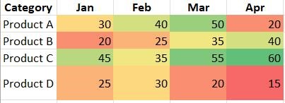
- Heatmap Chart: A heatmap uses color to represent values in a matrix-like format. The intensity of the color represents the value, making it easy to spot patterns.
When to Use :
- For visualizing large datasets with many variables.
- E.g., website activity, survey results.
Why Choose:
Ideal for understanding complex data patterns, especially in large datasets.
Example:
Comparison of All Graphs:
| Chart Type | Purpose | When to Use | Advantages | Disadvantages |
|---|---|---|---|---|
| Bar Chart | Compare categories or groups. | When you have categorical data with values to compare (e.g., fruit counts). | Easy to understand, visually clear, great for small to medium datasets. | Not great for showing trends over time or large datasets with many categories. |
| Line Graph | Show trends over time or continuous data. | When you want to display how data changes over time or in a sequence. | Excellent for visualizing trends, patterns, and continuous data. | Can become cluttered with too many data points. |
| Pie Chart | Show proportions of a whole. | When you want to show how parts contribute to the whole (e.g., market share). | Simple to understand for proportional data. | Not ideal for showing comparisons of small differences or multiple datasets. |
| Histogram | Show frequency distribution of continuous data. | When you have numerical data that falls into ranges or intervals. | Helps in understanding the distribution of data. | Not useful for comparing categories. |
| Scatter Plot | Show relationships or correlations between variables. | When you want to explore the relationship between two continuous variables. | Shows correlations, patterns, and outliers effectively. | Can be hard to interpret without clear patterns. |
| Area Chart | Show cumulative totals over time. | When you want to emphasize the magnitude of change over time. | Good for showing cumulative data and trends over time. | Can be harder to read if there are too many data sets. |
| Bubble Chart | Show relationships with an added dimension (size). | When you want to show relationships with three variables (e.g., time, size, and value). | Adds a third dimension of information with bubble size. | Can be hard to interpret if not clear. |
| Heatmap | Show data density or intensity. | When you want to show patterns in large datasets (e.g., survey results, website clicks). | Ideal for large datasets with many variables. | Can be overwhelming with too much data or hard to understand. |
| Waterfall Chart | Show incremental changes over time. | When you want to understand how an initial value is affected by subsequent values (e.g., profit/loss analysis). | Helps to break down data into sequential steps, useful for financial data. | Not ideal for small datasets or quick comparisons. |
| Radar Chart | Compare multiple variables across a common scale. | When comparing multiple variables or categories, e.g., product features. | Good for showing the strengths and weaknesses of different items/variables. | Can be hard to read with many variables or if scales are too different. |
| Tree Map | Show hierarchical data. | When you want to visualize parts of a whole with nested categories. | Ideal for visualizing large hierarchical data in a compact format. | Can become complex with deep hierarchies or too many items. |
How It All Works (Because Nothing Is Ever That Simple)
Data Collection: First, gather your data. You can pull it from anywhere—surveys, sales records, social media, or that dusty Excel sheet no one’s looked at since 2015.
Data Processing: Then, clean it up. If you don’t, your graphs will show that you had 200 customers in one week who ordered zero toasters. Clean data = fewer headaches.
Visualization Tools: Now comes the fun part. Whether you’re a Microsoft Excel junkie or you prefer something fancy like Tableau or Google Data Studio, there’s a tool for everyone. (Even you, person-who-hates-charts.)
Interpretation: Finally, you sit back and interpret what the visuals are telling you. “Oh look, sales dipped when Bob took over customer service. Interesting…”
The Perks (Or Why You Should Care)
Better Understanding: Visuals make things simpler. You don’t need a PhD to understand a bar graph that shows your cat café sold way more lattes in winter than summer. (Clearly, people need more caffeine when it’s cold.)
Faster Insights: Instead of squinting at a spreadsheet for hours, you can spot the obvious trends quickly. Like how the product you thought would flop is somehow your bestseller.
Improved Communication: Visuals are shareable and make you look like you know what you’re talking about at meetings. Need to explain why your new ad campaign tanked? A quick pie chart will have everyone nodding in no time.
More Engagement: When your data is interactive, like in a dashboard, people can click around and explore it. It’s like data, but fun. Well, more fun, at least.
 Master Inventory Management with These VBA Tips and Tricks
 Timing Your Investment: The Key to Successful Business Automation
 5 Ways Custom Web Apps Outperform Off-the-Shelf Tools
 Evaluating ERP Vendors in 2025: What You Need to Know
 How automation can lead to Big Impact on Tool Adoption
 How to Use Excel Macros to Enhance Team Efficiency
 From Idea to Prototype: Build Your Product Without a Dev Team
 Boost Your Small Business Credibility by Avoiding These 7 Common Website Mistakes
 Boost Your SME's Success with Smart UX Design
 The Future of ERP: Lightweight Tools for Growing Companies